2 October 2025
What does the Dior logo look like in 2025?
Journal Du Luxe
Under the impetus of its new artistic director Jonathan Anderson, the fashion house is offering itself a revisit of its lettering. A symbolic act that draws its inspiration from the history of the brand.
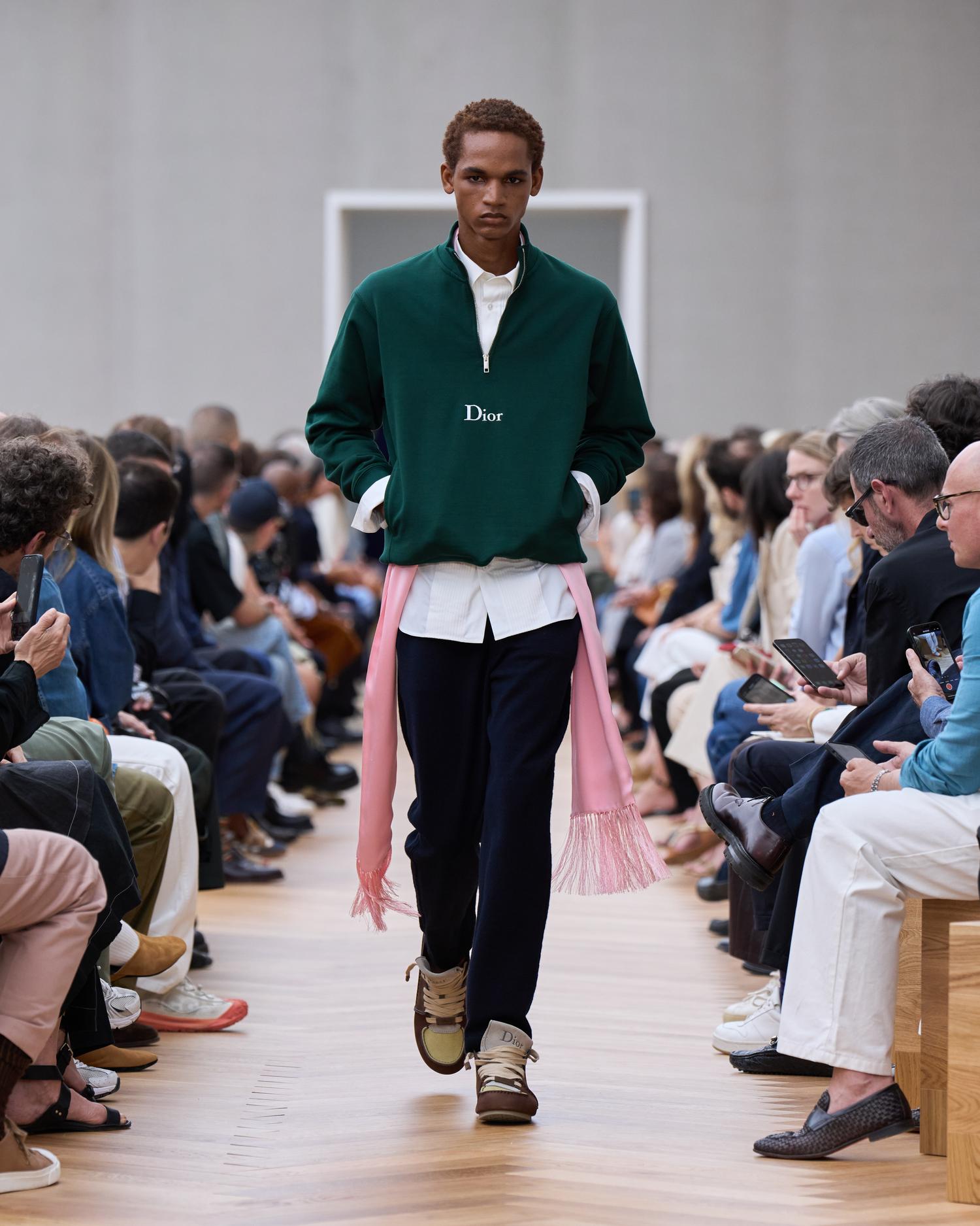
DIOR versus Dior. The change had already been felt last July, during the presentation of Jonathan Anderson's first men's show for Dior. Seen on teaser visuals but also on labels and other textile details on the catwalk, the 2025 version of the Dior logo has since officially established itself in the House's campaigns, including that of the best-selling Lady Dior bag.
A change confirmed this week on the occasion of the presentation of the first Dior Women's collection by Jonathan Anderson. Gone is the "DIOR" logo and its four capital letters: introduced in 2018, it now gives way to a typography favouring a capital "D" followed by lowercase letters.

